Beer label series
Art Direction: Jenny Kowalski
Category: Brand Identity, Packaging
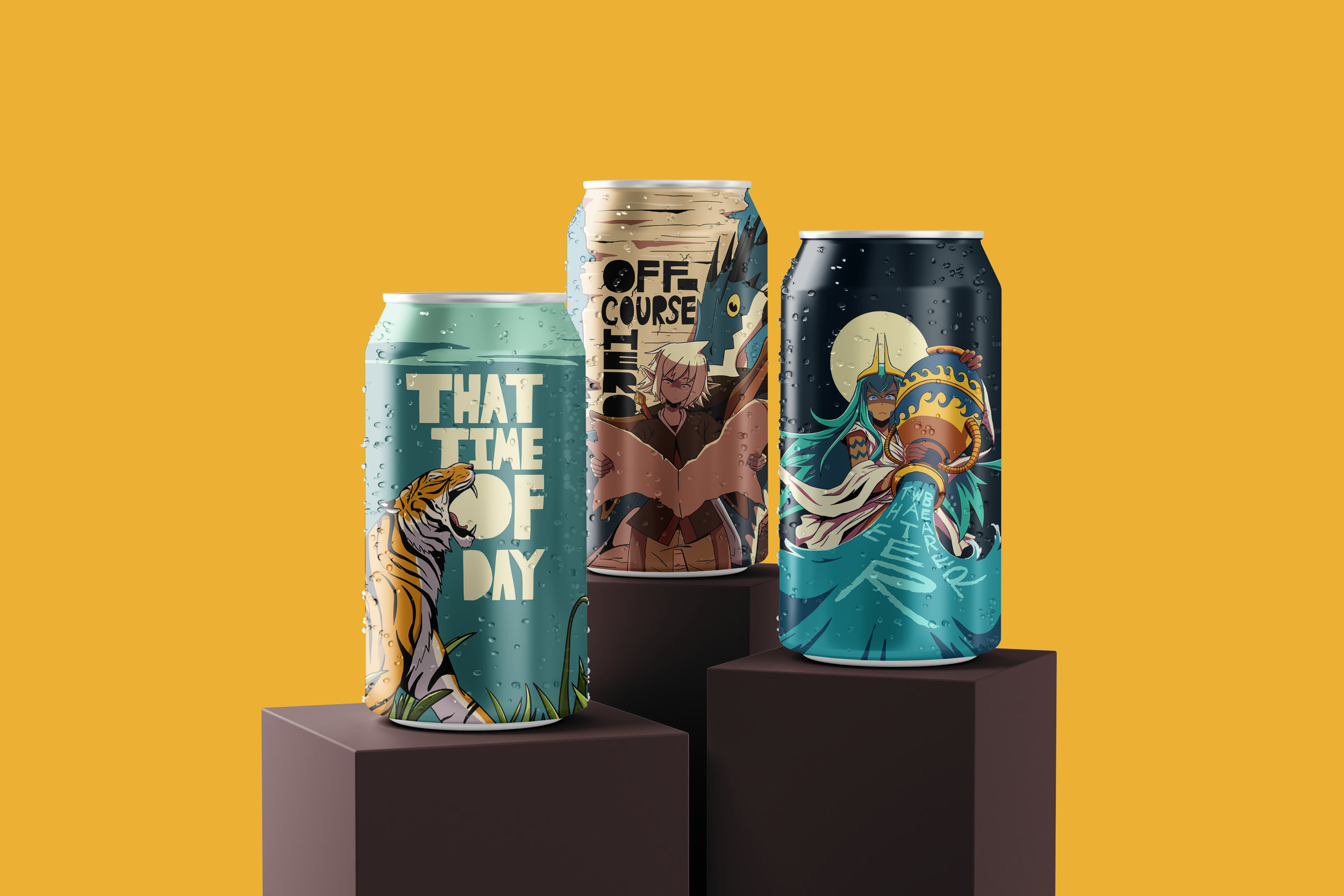
This project showcases three different beer labels from the fictional brewery, Mastodon Brewery. These labels were inspired by various energetic freeform illustrations and typographic styles seen on beer labels as well as the stories that some brands like to include . An important aspect of the project I kept in mind was making sure the illustrations and type had interesting and harmonious interactions.
These illustrations are the initial Mastodon Brewery logo sketches. The main points of design I strove accentuate were an uppercase “B” shape as well as the head of a mastodon.
The first logo was unsuccessful in portraying either the “B” or a mastodon entirely to viewers. The design needed a push towards different forms and exaggerations.
The final logo excels at pushing both the “B” and mastodon forms through exaggerations made in the tusk and further elephantine details. The logo now efficiently gets across the identity of Mastodon Brewery.