

Amiti
Art Direction: Abby Guido
Category: UX/UI, Brand Identity, Packaging
Amiti is a smartphone application with a companion smart ring that works as a social interaction coach for users. This app was inspired by data on how Generation Z is the loneliest generation so far and due to the COVID-19 quarantine, many people have been experiencing social difficulties. I created a full prototype of the app including goal setting, games, and chatting functions, as well as the companion ring that can sense when users begin to feel anxiety.
Read the case study on Medium
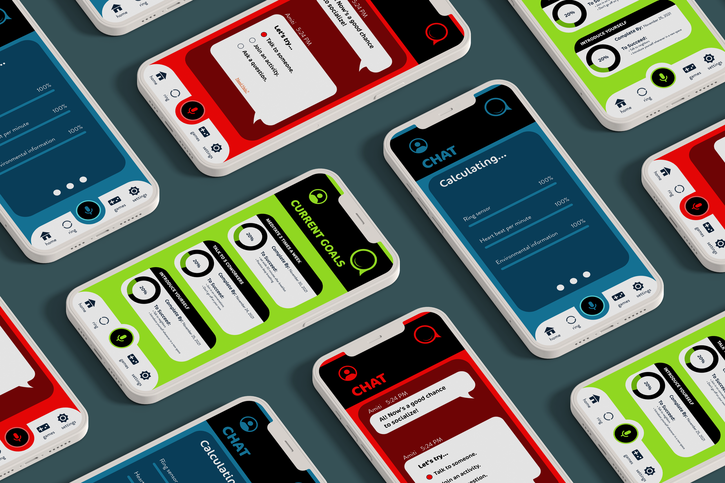

The logo for Amiti is meant to express the meaning behind the product as a whole. Amiti is a brand made for people who want to improve their social skills and socialize more. The logo’s open mouth encourages the speaking aspect of the app and its smiling face ensures it will be a safe and positive experience for the user. The icon shape alludes to both the lowercase ‘a’ in the name of the app as well as a speech bubble. The similarity in shape with a speech bubble links the app to a strong push in the direction of speaking with people you know and people you don’t. The design overall displays a product that will make engaging with others a positive, fun, and safe experience for those who need help.
Amiti, along with its companion smart ring work in a similar way to a smart mood ring. The color indicated marks the amount of anxiety the user is feeling through the ring picking up on the number of heart beats per second.
Depending on the anxiety reading and information Amiti receives upon turning on the app and ring, as well as using it while both are on, the logo will change color according to the anxiety range along with the rest of the app. The mouth of the logo opens when a new notification arrives or Amiti is giving the user tips for success.


